How to Create Multiple Button Styles in Squarespace 7.1
Here is how to quickly and easily use secondary and third form buttons to help you flesh out your site’s aesthetics and give it a truly unique feel. As with many things with Squarespace, it’s all about picking up their intuitive tools and seeing how best to turn them to your advantage. Let’s dive in.
Table of Contents in Detail Hide
Squarespace 7.1 and Fluid Engine
While it might seem obvious at first glance, it can be easy to overlook – but make sure you are running Squarespace 7.1 or higher for this guide to work, or you simply won’t be able to see some of the features we will be talking about in today’s article.
When you create a new website using standard template tools in Squarespace 7.1, you’ll find that one of the default options that the software puts in place is not only a welcoming splash image and headline, but also buttons that encourage users to take certain actions.
By default, these might not necessarily fit the branding style or overall look you’re going for, but that’s okay – adjusting these is exactly what today’s article is all about.
Understanding Primary, Secondary and Tertiary Buttons
Each of the buttons used in Squarespace 7.1 has a particular level of functionality for you to take advantage of. This means you can adjust the styles of the buttons, definitely – but also that you’re able to very easily create complementary actions for them to ramp up user engagement too, cleverly blending functionality of primary, secondary and tertiary buttons together.
For example, a good idea for a primary or ‘first’ style of button is a ‘Contact’ button for your website. Users value being able to reach you if they have issues, and it makes sense that this would be a relatively major feature to include.
However, you can also use Squarespace 7.1 buttons to complement that. For instance, you can set up your primary call to action button as a Contact button, then add a transitional call to action via a secondary button labeled ‘book a call’ or ‘watch a demo video’.
Changing a Button Style in Squarespace 7.1
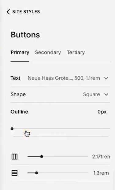
The real magic, of course, happens when you go into the design tools available to you in Site Styles and begin changing how your site buttons look. There are a lot of pretty simple yet effective tools here to really make your aesthetics your own.
One of the biggest changes Squarespace has introduced here is that of outlines, which you can adjust on every button style. Doing so is as simple as diving into the menu and determining the pixel width and color of the outline you’ll be using.
Two pixels for an outline is often a sweet spot that pops, but you can go higher or lower, depending on your site’s look and feel.
You can also adjust the spacing of every type of button in Squarespace 7.1, which is easy to do by tinkering with the setting in the sidebar. Doing this can help the visual layout of your site, as well as format it in a way that translates from desktop to mobile cleanly.
Keep in mind that there is a lot of aesthetic power you can unlock by using the fill and no fill options too. Just as the name implies, these elements control whether or not the button is filled – it lets your outline do the talking, if you prefer, and also lends a more minimalistic edge to buttons you might not want to pop as much as your primary or some secondary ones.
Squarespace 7.1 Buttons Are Easier to Modify Than Ever
The beauty of the changes that have been made to buttons in Squarespace 7.1 is that they have massively streamlined what used to be a more intensive and technical process.
Sure, changing buttons was possible before, but it took a fair amount of time and coding knowledge – and even if you already had that, there’s no denying that these drag and drop intuitive menu interfaces make for far more effective and efficient design work.
Speaking of which, stick with us and our blog in the coming weeks and months – we’ll continue exploring how to maximize your online potential with ease.
Need More Help?
We’re in the business of new Squarespace designers, and regularly produce free resources to help developers and business owners alike come up to speed quickly on the Squarespace platform. The faster you learn the time-saving tips and tricks, the quicker you can get your online presence created, and the faster you can start earning money. Here is a list of a few of our offerings:
Instructional guides on a wide range of relevant topics
A free newsletter delivered to your inbox every month
A powerful SEO audit tool to evaluate your Squarespace site


